Table of Contents
Introduction
Opmantek's opCharts module is an industry leading custom dashboard tool designed specifically to enable users to generate targeted, custom single-pane of glass views into the network's performance - both current and over time. Drawing data from NMIS as well as 3rd party SQL databases, opCharts puts the power into the user's hands to build dynamic interfaces by combining Components into single or multilayer visual landscapes called Dashboards.
...
Executive or technician - opCharts gives each user the power to easily organize and view their network's performance the way they want to see it.
Overview
opCharts supports five primary views: Nodes, Interfaces, Monitored Services, Dashboards, and TopN.
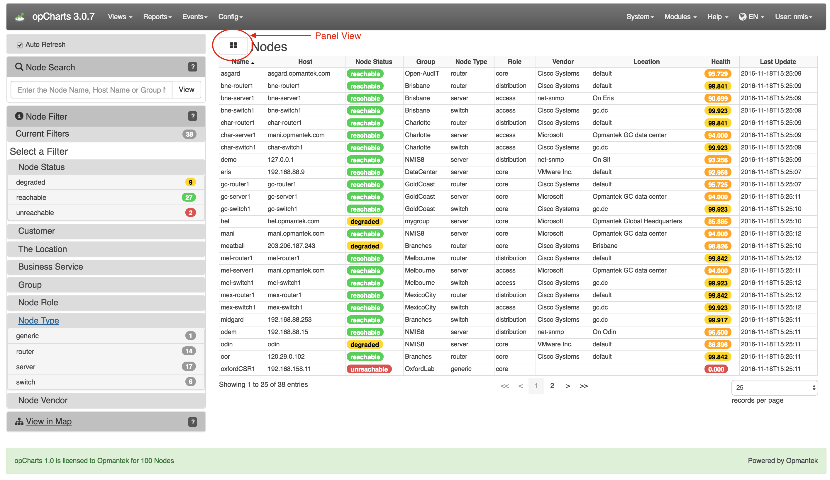
Nodes View
To open the Nodes View, select Views -> Nodes from the opCharts menu bar. By default, this displays a list of all nodes in your environment, but you can also select Panel View to abstract each nodes performance information into easy-to-understand panels. These panels include such information as the node name, node status, vendor, and key performance information regarding each node.
The Nodes view is the default view for opCharts unless a default Dashboard has been assigned to the user account
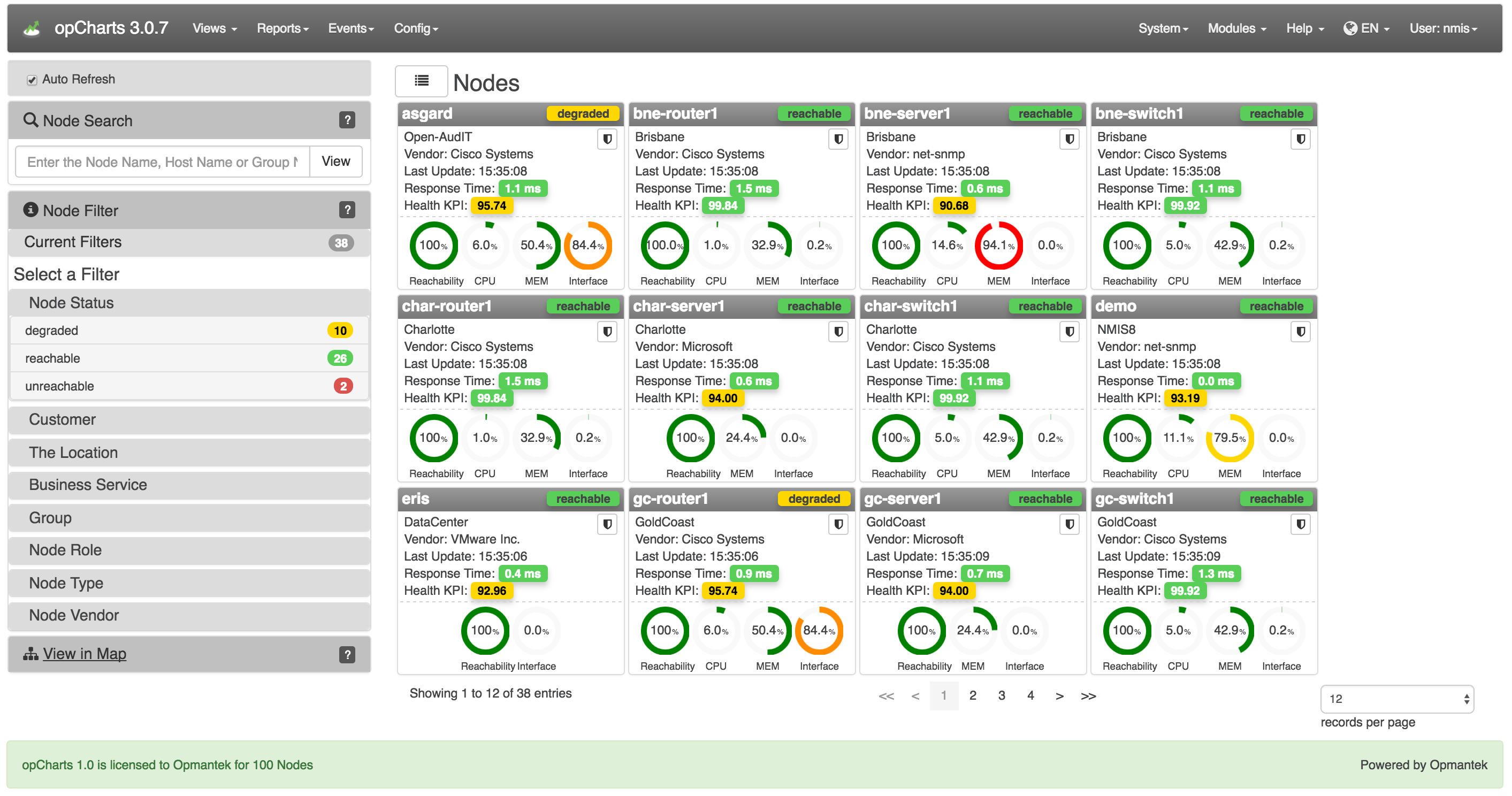
Panel view
In this view each node is represented by a panel versus a line in a table. Each panel provides important information for the represented node. Some of this information is conveyed via dials. There are two options to chose from in regard to how data is displayed in the 'node panel dials'. Please refer to the administration guide in order to switch between the two panel dial options.
Node Panel Dial Display Options:
- KPI based
- Resource based
KPI based
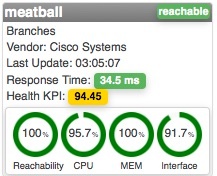
In this mode the dials represent the health of the KPI being measured, higher ratings are more desirable. In the example below with the CPU at 4.3% utilization the KPI score is 95.7%; a desirable condition. If a KPI value is below the desired standard the dial will turn red.
Resource based
In this mode the dial represents the amount of resource consumption. In the example below the CPU utilization for asgard is at 6%; a desirable and the dial is green. The memory usage of bne-server1 is at 94.1%; an undesirable condition and the dial is red.
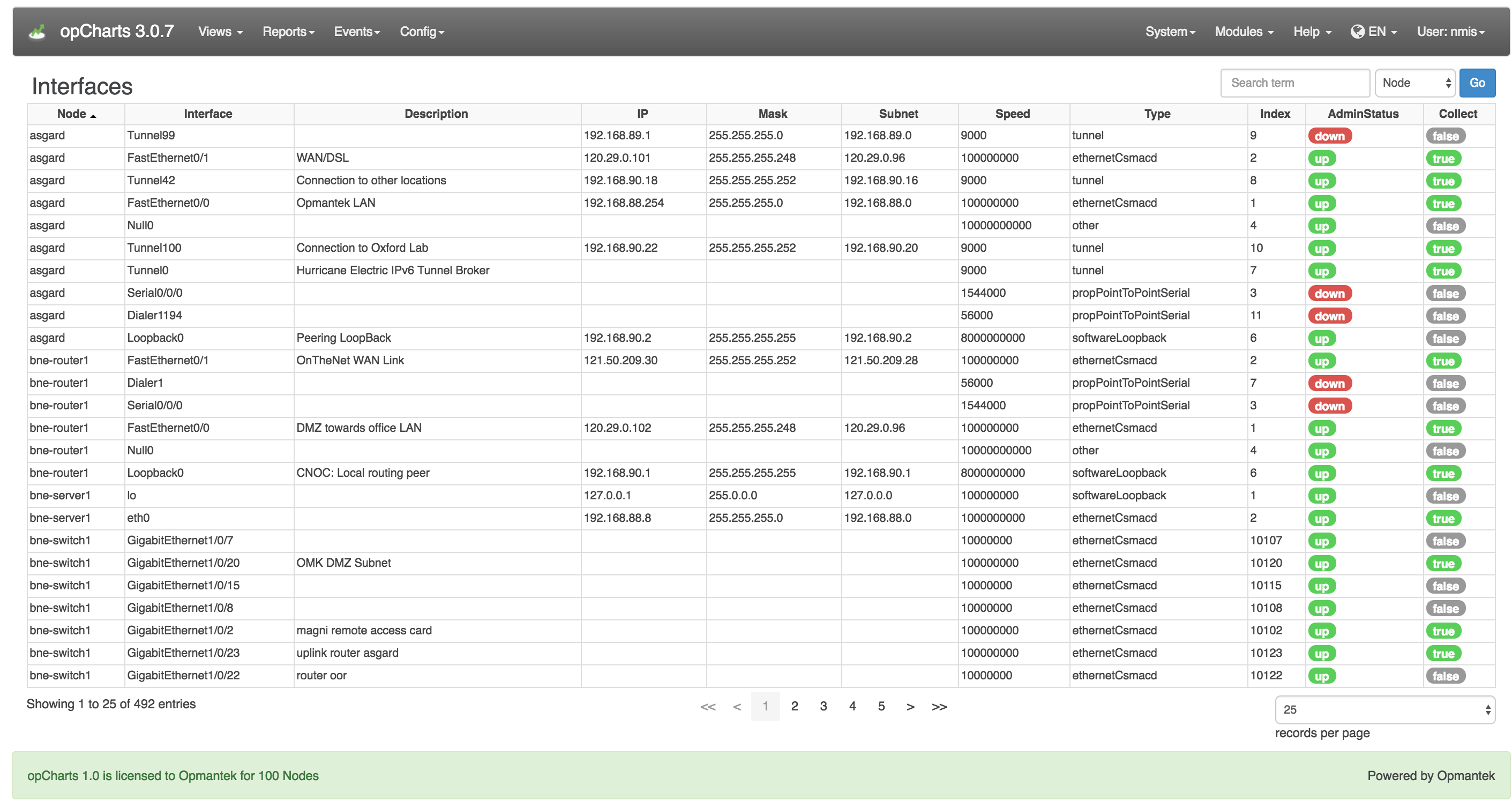
Interfaces View
To open the Interfaces View, select Views -> Interfaces from the opCharts menu bar. This view provides an easy-to-search list of all interfaces in your environment. From here, the user can drill down into the details of individual nodes and interfaces.
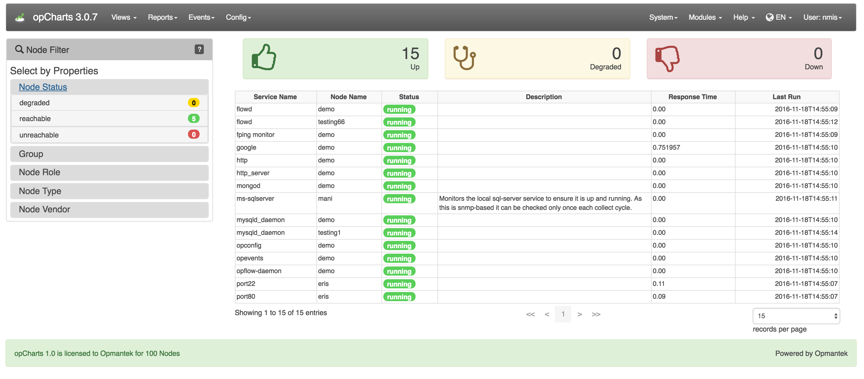
Monitored Services View
To open the Monitored Services View, select Views -> Monitored Services from the opCharts menu bar. Services can be filtered by groups such as node status and group.
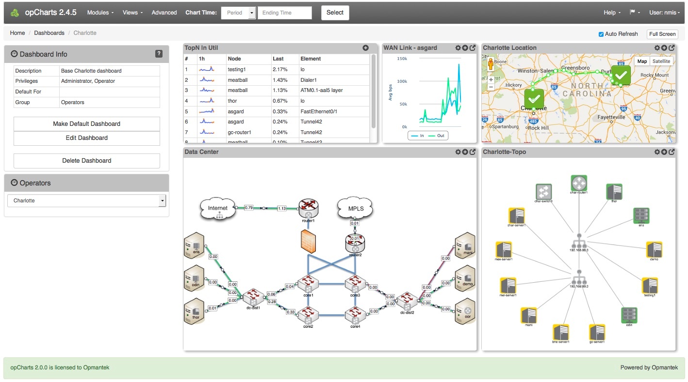
Dashboards View
To list all available Dashboards, select Views -> Dashboards from the opCharts menu bar. From there, the user can select to create a New Dashboard, and View/Edit/Delete an existing Dashboard.
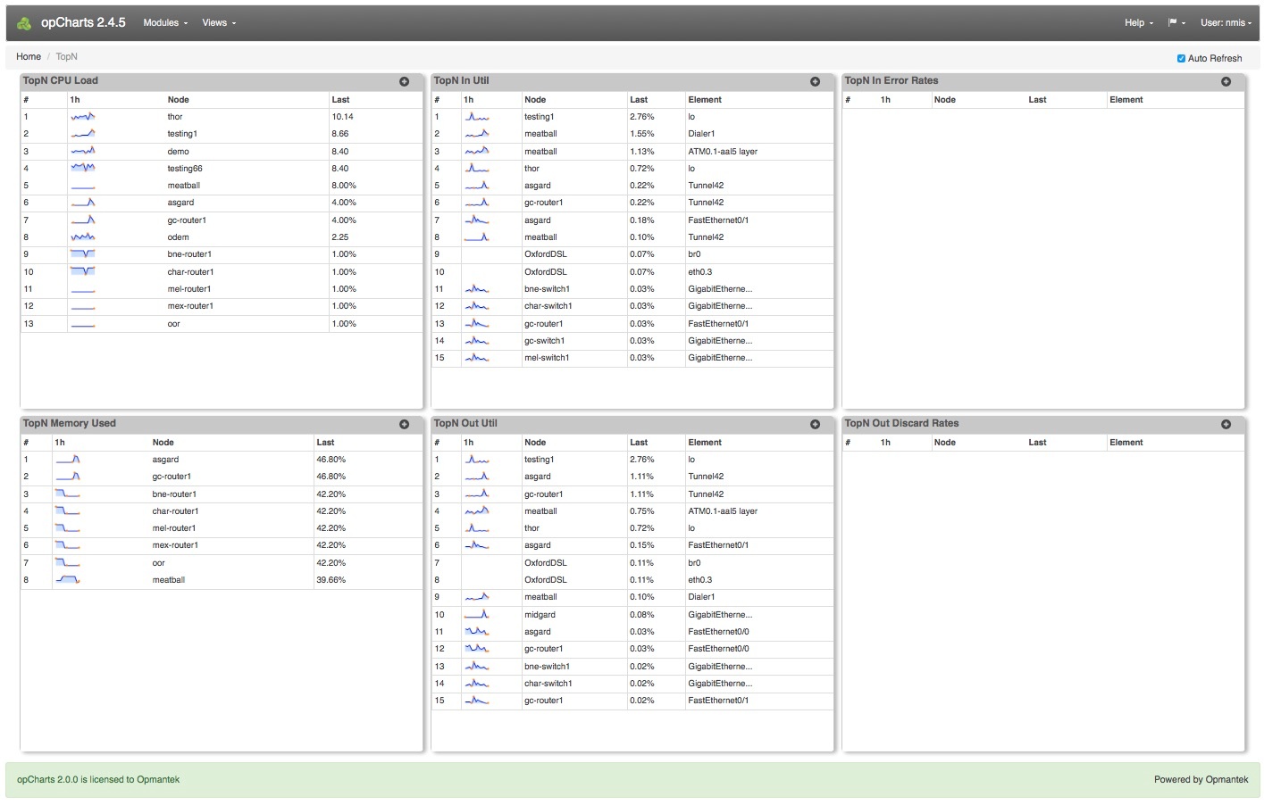
TopN View
The open the TopN View, select Views -> TopN from the opCharts menu bar. The TopN view is actually a collection, or predefined dashboard, comprised of six opCharts Components. Any of these TopN charts can each be added to a new or existing Dashboard (see: Dashboards for more information) to create custom views.
Detail Pages
Please see these additional pages for more detailed information on using opCharts.
...