| Table of Contents |
|---|
Dashboard View
The default view in opEvents shows the Dashboard which displays the Events by Node. From this page you can visually see which devices are generating the most events. Clicking on the pie chart or the graph to the right of it allows you to drill into the events of a specific device or the list of events that occurred in specific time periods. Clicking on the device name at the bottom of the Events by Node charts allows you to filter out devices you do not want to display on the charts granting you the ability to customize your charts view. In the table below the two charts you can see the time of the event, the node, the event name, description of the event, the amount of times this event occurred, the priority, and the most recent state of the node. These can be sorted by event count, priority, event name, or which ever makes finding relevant events easier. The table also has a search field located above the count column making finding specific events quickly. With the time filter located in the top right of the chart you can filter the time period to view events generated during certain time windows.
...
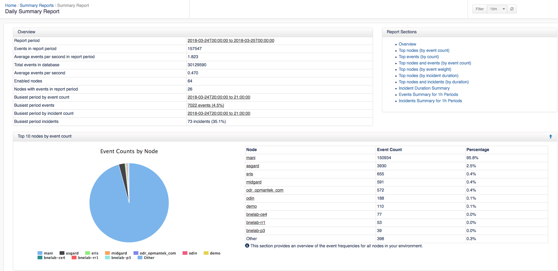
To view a report click on a link in the Title column or Download the file. The Summary displays: Overview, Top 10 nodes by event count, Top 10 events by count, Event Priorities by count, Top 10 nodes and events by event count, Top 10 nodes by event weight, Top 10 nodes by incident duration, Top 10 nodes and incidents by duration, Incident Duration Summary, Events Summary for 1h Periods, and Incidents Summary for 1h Periods. To see what the full report looks like you can download an example report HERE.