...
| Variable | Description |
|---|---|
| (1) Filter | Applies or removes No filter displays all applications. Applying the HTTPS filter to the chart.displays only HTTPS applications |
| (2) Time Period | Select the time period for the chart. (15m - 2d) |
| (3) Bits/Sec | Information displayed in bits per second. This can also be displayed in Flows/sec and Packets/sec (Advanced) |
| (4) Time | Start time defined by Time Period filter. |
| (5) %Util | Percent utilization. |
(6) Source | The source of captured flows. |
| (7) Bits | Total bits sent out from the source over the selected Time Period. |
| (8) Pkts | Total packets sent out from the source over the selected Time Period. |
| (9) Intf Util (%) | Displays the interface utilization percentage of each source. |
Where the time is displayed at the bottom of the chart in the image above(4), each point in the graph represents an amount of data transferred over a time period. In this example above, the Time Period is set to 2 hours which causes the information to be displayed in 10 minute intervals. The summarization period is chosen by opFlow so that the amount of data put in the chart is reasonable (we generally go for around 42 data points per chart) and depends on the size of the overall period for the page. For example, the graph in the image below shows that between 11:02 and 11:04, 10 megabits were transferred. The graph also displays the %Util (5). When looking at the image above you can see that those spikes never go above 4% utilization.
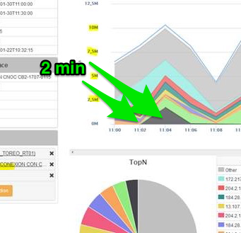
Lets say the interface can transfer 2 mb/s, so in 2 min it can transfer (2*60*2) 240mb. 10mb/240mb = ~.04 or 4%. Understandably this may not be how a network engineer would think about the data (in amount transferred). opFlow has an option to display the graph in bits/second instead of just bits. The config option 'opflow_gui_graph_over_time_per_sec' => 1 changes the graph.
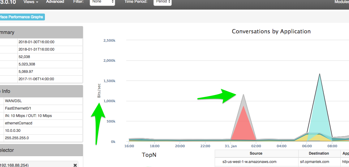
The images below show examples of charts displaying in Bits vs. Bits/Sec to highlight the difference that the config option opflow_gui_graph_over_time_per_sec makes. The first image directly below is displaying in Bits.

This second image is displaying a graph in Bits/Sec for the same data and time period. You can see in the summary box on the left of the images above and below that it is indeed using the same data and Time Periods.
The advanced menu gives more options for viewing flow information:
...