...
Creating a New Custom Chart
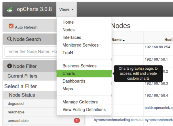
From the opCharts home page navigate to the charts view.
The resulting Charts page will look something like the following. From here via the administrative action palette we can add, edit, delete, and set permissions to charts.
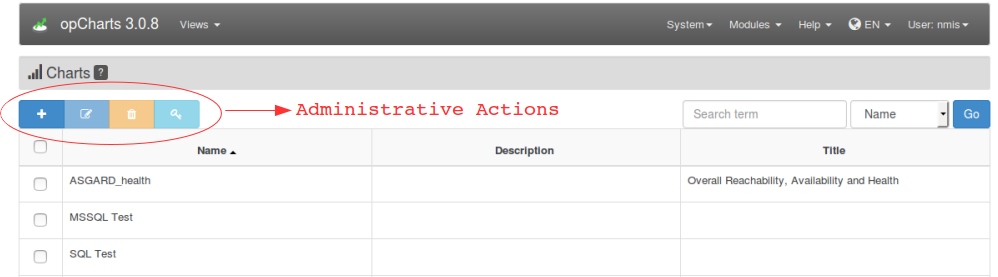
Click the blue '+' button to create a new chart and we will be presented with a page such as the following. The only mandatory field is the chart name. All other fields and be left blank and edited at a latter time.
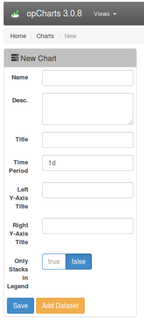
Field Descriptions
| Field Name | Function |
|---|---|
Name | This name is primarily administrative and will be used to identify the chart on the Views->Home->Charts page. |
| Desc. | A description field that will appear on the Views->Home->Charts page. |
| Title | This title will appear at the top of the chart. |
| Time Period | The default time period of the chart when it is initially displayed. Once you start typing the format and options will display. A user may change this once the chart is selected in order to access the time period they are interested in. |
| Left Y-Axis Title | This description will appear on the left side of the chart representing the scale of the 'axis 0 axis''. When selecting the data set we well be presented with the axis option. |
| Right Y-Axis Title | This description will appear on the right side of the chart represting the scale of 'axis 1' . When selecting the data set we well be presented with the axis option. |
| Only Stacks in Legend | No ideaNeed to define! |
| Save | Select this to save the chart. |
| Add Dataset | Select this to add data sets to the chart. |
Adding Datasets