...
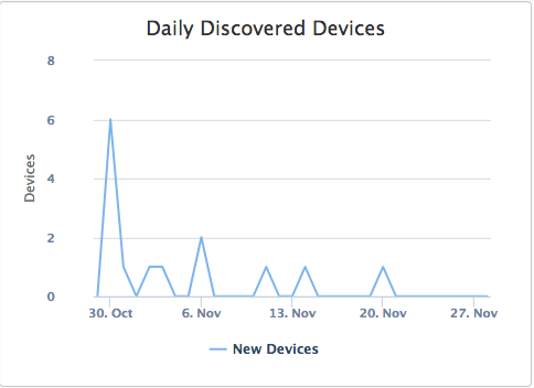
Devices Discovered over the last 30 Days. This graph should show a relatively consistent line. Any spikes in the graph represent new devices being discovered and if not explainable, some investigation should occur. An obvious example is deploying a new batch of replacement Windows PCs would generate a spike - but this is expected. If no new deployments are occurring and a spike occurs, new devices have been discovered and may be cause for investigation. you can click on the individual days data point on the graph to show a list of new machines discovered on that day. From this list you can click a machine name to see the specific machine details as discovered by Open-AudIT.
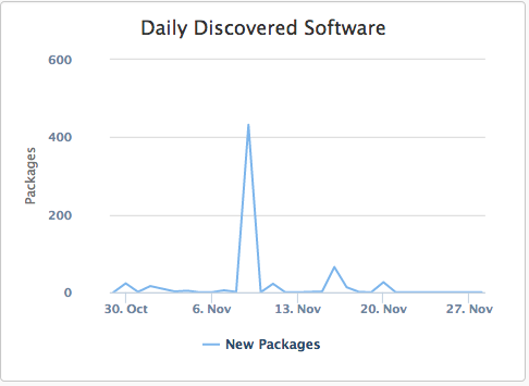
Software Discovered over the last 30 Days. This graph represents any new software packages detected over the last 30 days of audit. Note that this graph examines software packages, not machines. Therefore a deployment of (say) Adobe Reader to 100 machines would only represent one new piece of software being discovered on any given day. You can click the individual days data point on the graph to show a list of the new software packages discovered. From this list you can click a software package name to see which machines it was detected on, on that day.
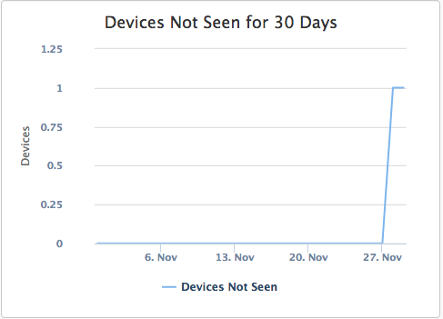
Devices Not Seen for 30 Days. Items occurring here are devices that have not been detected on the network for 30 days that are still marked as being in production within the Open-AudIT database. This line should be expected to be consistently as close to zero as possible. Any devices that are considered in production should be audited more than once every 30 days. Ideally each day.
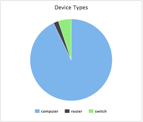
Device Type Percentage. A simple pie chart to illustrate the percent of the different device types within the Open-AudIT database. If the device type of Unknown occurs, this should be investigated as Open-AudIT has seen a device but was not able to determine its type.
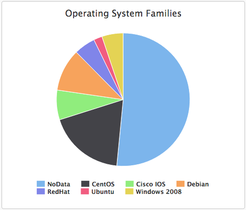
Device Operating System Type Percentage. A simple pie chart to illustrate the percent of the different operating system types within the Open-AudIT database.
These dashboard graphs are pre-configured in Open-AudIT Enterprise and updated whenever the page is requested (live). Additional graphs can be constructed upon request.
Maps
If you have configured Locations in Open-AudIT with the associated Groups enabled and devices assigned to those Groups, Open-AudIT Enterprise will show you these Locations using Google Maps and display a pop-up when a marker is clicked, containing the number of device types. The test for each device type is clickable and upon being clicked will show (inside Open-AudIT) the relevent devices in the particular location. If the Location Name is clicked, all devices will be shown in that location in Open-AudIT.
...