Overview
The NMIS Chart is the base Component in opCharts, replicating each of the charts available natively in NMIS and providing the ability to create custom compound charts by combining multiple data sets, from any device, onto one chart component.
Accessing a Basic Chart
opCharts automatically creates a chart for each and every metric being reported back to NMIS. These charts can be accessed from within the Node Details screen. Select Views -> Nodes from the opCharts menubar, then select a node from the list to open the Nodes Detail screen.
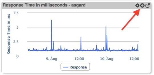
Any displayed chart can be added to a dashboard (existing or new) by clicking the Add to Dashboard button in the chart's titlebar.
Building a Simple Custom Chart
A good example of a Simple Custom Chart is the Overall Reachability, Availability, and Health chart. This chart is available in each node's Node Details screen, as shown below...


Notice how the expanded chart includes four separate metrics, all normalized into a percentage of use or availability. This normalization allows all four metrics to be displayed relative to each other without skewing the chart's scale or being forced to use the right-hand axis.
This chart, and others, can be used as-is, edited, or created from scratch.
A More Compound Chart
For charts that include non-normalized data (ie data with base values which are either very dynamic or are widely separated) you can...
Chart Considerations