What is a single pane of glass and why is it so important?
"A single pane of glass is a management console that integrates information from multiple components into a unified display." - whatis.com
A few of the benefits to having a single pane of glass:
Increasing visibility - Ensuring that the status of everything is visible.
Reducing operational complexity - A single place to see the status of everything.
Reducing time to root cause - No silo's, all technologies, all vendors, all operating systems in a single place.
A single pane of glass is one management system which supports:
- Multiple vendors
- Multiple technologies
- Multiple operating systems
A single pane of glass allows for you to:
- See the current state of all systems from one place.
- See the history of all systems in one place.
- Provide operations teams with a single place to login and see what is happening.
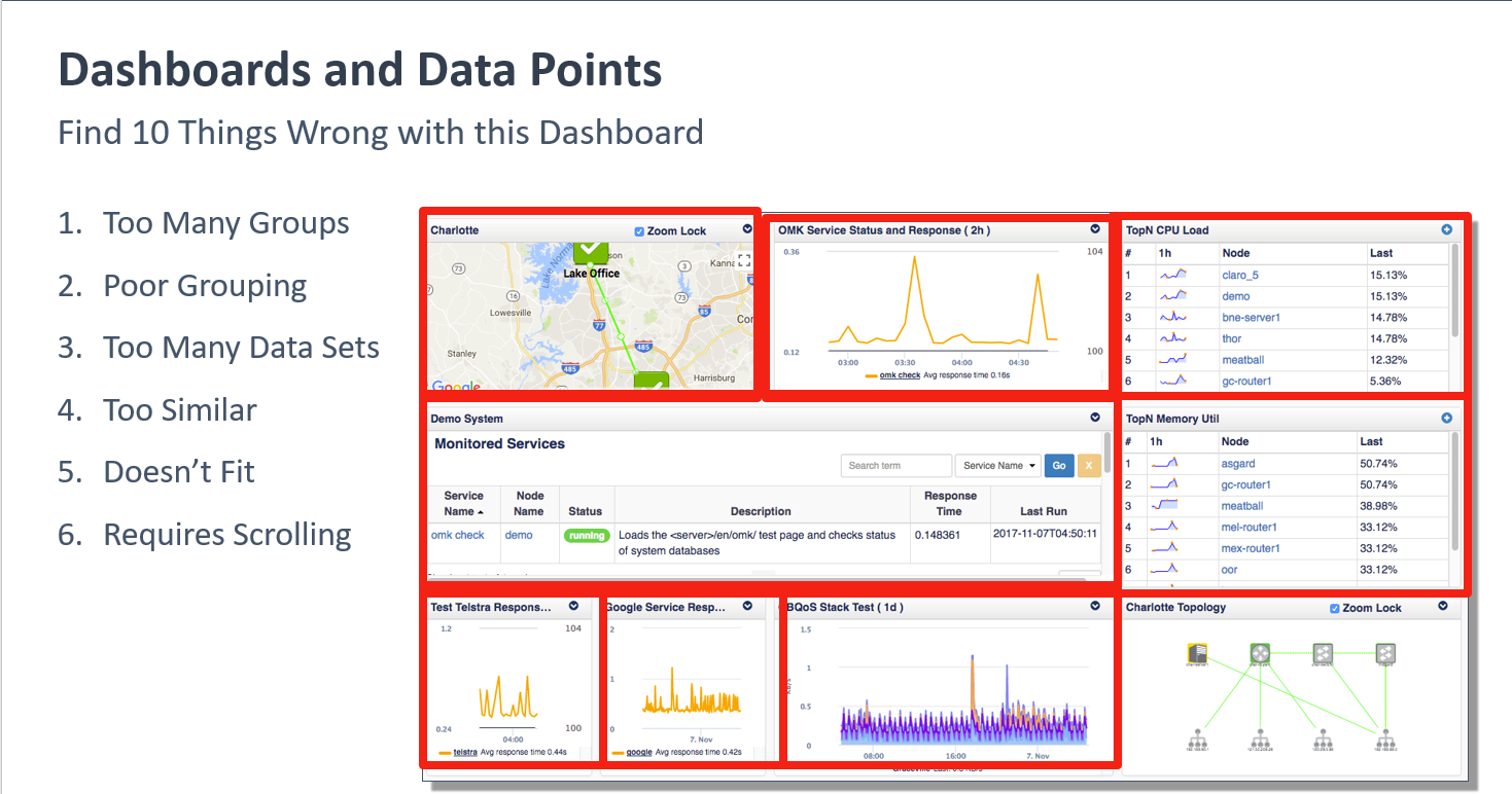
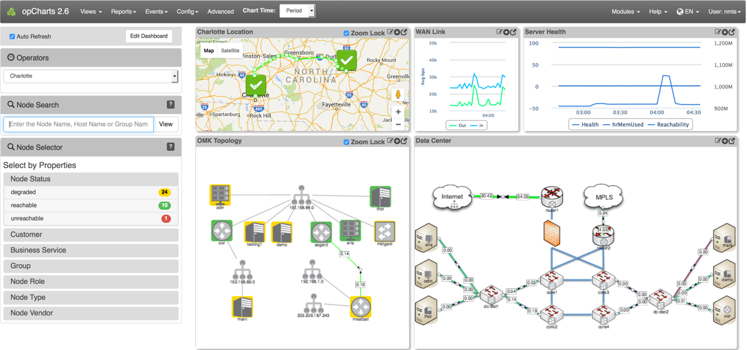
Example of a well designed dashboard:
How to get a Single Pane of Glass using NMIS and opCharts
First, install NMIS there are two choices in going about doing this:
1. Install NMIS from scratch.
Here is a link to an NMIS installation guide available on the Opmantek Community WIKI:
https://community.opmantek.com/display/NMIS/NMIS+8+Installation+Guide
2. Use the Opmantek Virtual Appliance.
Opmantek Virtual Appliance Installation guide
Opmantek Virtual Appliance: Installation and Getting Started
After NMIS is installed you then need to Install/upgrade opCharts
Install/upgrade opCharts - opCharts Installation Guide
Get a free trial license key for opCharts - https://opmantek.com/opcharts-dashboards-charts-management/
How much data is the right amount, and how much is too much?
Before getting into creating a dashboard you should understand what goes into designing a useful dashboard.